Custom attributes New
You can now define your own attributes.
Either you define all 3 of them at once, or you can define 1 or 2 depending on your choice. The default attributes will be used.
    <script>
        ModCSS.attributes({
            grid: 'mod',
            props: 'xyz',
            var: 'let',
            })
    </script>

    <div mod="row[100%]">
       <div xyz="col$[5rem] co[orange]">5rem</div>
       <div mod="col[25%]">25%</div>
   </div>

   <div let=".col{ col$[auto] h[10px] }">auto</div>
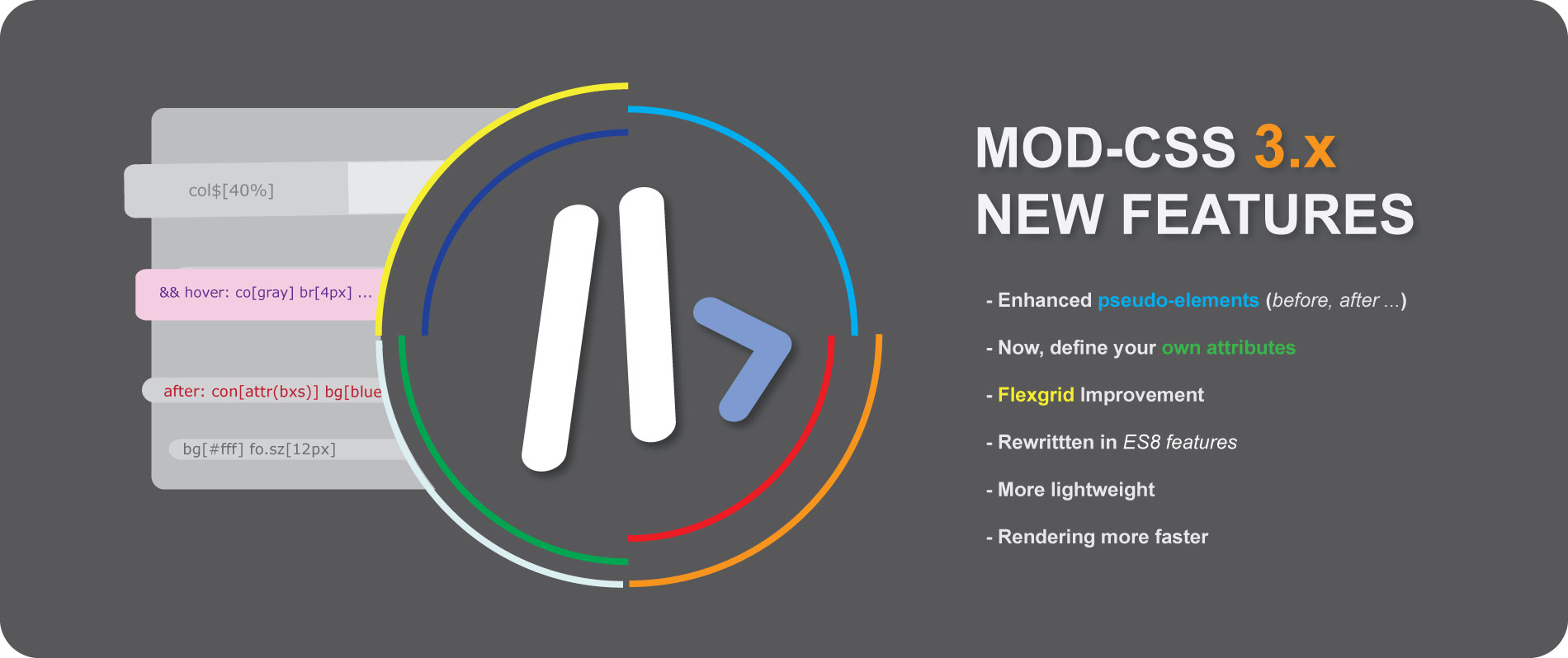
Flexbox grid New
Our flexbox based grid can use any css units, can setting gap and offset, automatic sizing, custom width etc...
It is probably the most complete flexbox based grid ever created.
With last released, you can use our flexgrid properties with all others attributes and use them to define a selector.
Row's width is set to 100%.
Columns can be any size. If overflow, new row is created.
Column "auto" get remaining space.
    <div :mod="row[100%]">
        <div :box="col$[5.4rem]">5.4rem</div>
        <div :mod="col[100px]">100px</div>
        <div :mod="col[25%]">25%</div>
        <div :mod="col[auto]">auto</div>
    </div>
Row with gap set on 10px.
You can use any arbitrary value.
    <div :mod="row[100% 10px]">
        <div :mod="col[auto]">auto</div>
        <div :mod="col[auto]">auto</div>
        <div :mod="col[auto]">auto</div>
        <div :mod="col[auto]">auto</div>
    </div>
On "Auto", row is set in according absolute value you set on one or many columns. Be carefully with this.
    <div :box="row$[fit]">
        <div :mod="col[5rem]">5rem</div>
        <div :mod="col[25%]">25%</div>
        <div :mod="col[auto]">auto</div>
    </div>
Columns with offset.
On row set a % or any rather than "auto" give you more flexibility.
    <div :mod="row[100%]">
        <div :mod="col[auto 5%]">auto offset 5%</div>
        <div :mod="col[fit 15%]">fit with offset 15%</div>
        <div :mod="col[250px]">250px</div>
        <div :mod="col[10vmax]">10vmax</div>
    </div>
Breakpoints
We have six breapoints : xs, sm, md, lg, xl, xxl.
They can be used for responsiveness on any CSS properties, our pseudo-classes, our Felxgrid and for setting classes.
On any screen, width is 100% only from lg screen, width get 55%.
<input :box="w[100%] || lg? w[55%]" type="text" placeholder="Type here">
According screen size, we change columns width.
The third column will be hide on lg screen. For this, we set display property on none.
     <div :mod="row[100%]">
        <div :mod="col[100%] || md? col[37.5%] || lg? col[50%]">col</div>
        <div :mod="col[100%] || md? col[37.5%] || lg? col[50%]">col</div>
        <div :mod="col[100%] || md? col[25%]" :box="lg? dsp[none]">col</div>
    </div>
Pseudo-elements New
Now, we fully supports ::before, ::after, ::marker and all others pseudos-elemnents.
Pseudo-elements works like Pseudo-States. just use two points :: before settings.
We set pseudo before with props.
Some quotes, he said, are better than none.
    // Set a selector
    <div :var=".q::before { con['_'] co[blue] }"></div>
    <div :var=".q::after { con['E6'] co[blue] }"></div>
    <p>Some quotes, he said, <span class="q">are better than none.</span></p>

    //Or set props on HTML element
    <p>Some quotes, he said, <span :box="before:: con['_'] co[blue] && after:: con['E6'] co[blue]">are better than none.</span></p>
We change marker color.
- Line 1
- Line 2
- Line 3
- Line 4
    <ol :var="li::marker { co[red] }">
        <li>Line 1</li>
        <li>Line 2</li>
        <li>...</li>
    </ol>
Styling grammar-error.
My friends is coming to the party tonigt.
<p>My friends is coming to the party <span :box='grammar-error:: tx.de[wavy underline blue] co[orange]'> tonigt</span>.</p>
Pseudo-States
You can also use focus, active and all others pseudos-classes.
On bootstrap button, we change background, color and border on hover.
<button class="btn btn-success" :box="hover: bg[purple] co[lightblue] bd[none]">..</button>
On checked, we change background-color.
Clic to turn into blue
<input type="checkbox" :box="w*h[32px] ... && checked: bg[#3137fd80]">
When input is focused, we set background-color to transparent and bottom line in blue.
<input class="input-line" :box="focus: bg[none] bd.co[blue]" type="text" ..>
Selectors
On new version, MOD-CSS supported now creation/setting of selectors.
If you use Bootstrap for example, you can easily update any class. You can do that with other CSS Framework like
Bulma, Tailwind.
We've created a class who design a special input with only bottom line like google Material.
// 1st. Create new class
<div :var=".input-line { w[100% !important] m.tp[6px] p[.3rem] p.lf[1rem] h[35px] co[lightgray] bg[#90909010] ot*bd[none]
    bd.bt[1px solid gray] && focus: bg[none] bd.co[gold] }"></div>

// 2nd. Set class on element
<input class="input-line"  type="text" placeholder="Type here">
On checked, we change background-color.
- Line 1
- Line 2
- Line 3
- Line 4
- Line 5
- Line 6
1. Set selector
    <div :var="li { p[4px 6px] m.bt[2px] }"></div>
    <div :var="li:nth-child(even) { bg[#202020] co[#f4f4f4] }"></div>
    <div :var="li:nth-child(odd) { bg[lightblue] co[blue] }"></div>

2. Create your elements
<ul :box="ls[none]">
    {% for x in '123456' %}
    <li>Line {{ x }}</li>
    {% endfor %}
</ul>
We've updated hover's properties of a Bootstrap button.
// Update and setting classes
<button class="btn btn-primary" :var=".btn-primary:hover { bg[#0f256e] co[lightblue] bx.sh[0px 2px 3px 1px #12ace930] }">
Primary</button>
We've updated background-color and some effects of a Bootstrap button.
// Update and setting classes
<div :var=".btn-secondary{ bg[#EC3883] bd[none] && focus*hover: bg[#EC388380] co[pink] bx.sh[0px 2px 3px 1px #ea10a580]}"></div>

// or set ID or any other selector
<div :var="#btn{ bg[#EC3883] bd[none] && focus*hover: bg[#EC388380] co[pink] bx.sh[0px 2px 3px 1px #ea10a580]}"></div>

// HTML Element
<button class="btn btn-secondary" id="btn">Secondary</button>
MOD-CSS remove all :var attributes with their value after rendering. So, we keep your setup in safe.
Only your selectors configured on :box attributes are kept after rendering.
// Your setup in your HTML
<div :var=".input-line { w[100% !important] m.tp[6px] p[.3rem] p.lf[1rem] h[35px] co[lightgray] bg[#90909010] }"></div>

// After rendering on client
<div></div>
Height & Width
lorem ipsum dolor sit amet consectetur adipisicing elit sed do
lorem ipsum dolor sit amet consectetur adipisicing elit sed do
lorem
     // height 30px, width 90%
    <p :box="h[30px] w[90%]">lorem ipsum dolor ...</p>

     // height auto, width 400px
    <p :box="h[auto] w[400px]">lorem ipsum dolor ...</p>

     // set height & width in once
    <p :box="h*w[40px]">lorem</p>
Margin
lorem ipsum dolor sit amet consectetur adipisicing elit sed do
lorem ipsum dolor sit amet consectetur adipisicing elit sed do
lorem ipsum dolor sit amet consectetur adipisicing elit sed do
     // Margin-left
    <p :box="m.lf[30px]">lorem ipsum dolor ...</p>

    // Margin-right
    <p :box="m.rg[30px]">lorem ipsum dolor ...</p>

    // Margin X & Y
    <p :box="m[30px 15px]">lorem ipsum dolor ...</p>
Padding
lorem ipsum dolor sit amet consectetur adipisicing elit sed do eiusmod
lorem ipsum dolor sit amet consectetur adipisicing elit sed do
lorem ipsum dolor sit amet consectetur adipisicing elit sed do eiusmod
     // Padding-top
    <p  :box="p.tp[10px]">lorem ipsum dolor ...</p>

     // Padding-right
    <p :box="p.rg[20px]">lorem ipsum dolor ...</p>

    // Padding
    <p :box="p[10px]">lorem ipsum dolor ...</p>
Color
lorem ipsum dolor sit amet consectetur adipisicing elit sed do
    // standard name
    <p :box="co[blue]">lorem ipsum dolor ...</p>

    // Hex Value
    <p :box="co[#0d6efd]">lorem ipsum dolor ...</p>

    // RGB or RGBA Value
    <p :box="co[rgb(13, 110, 253)]">lorem ipsum dolor ...</p>

    // variable
    <p :box="co[var(--txt-title)]">lorem ipsum dolor ...</p>

    // hsl and any others unit(s) supported by CSS
    <p :box="co[hsl(216, 98%, 52%)]">lorem ipsum dolor ...</p>
Font
lorem ipsum dolor sit amet consectetur adipisicing elit sed do
lorem ipsum dolor sit amet consectetur adipisicing elit sed do
lorem ipsum dolor sit amet consectetur adipisicing elit sed do
     // Font-size
    <p :box="fo.sz[12px]">lorem ipsum dolor ...</p>

    // Font-style
    <p :box="fo.sy[italic]">lorem ipsum dolor ...</p>

    // Font-family, Font-weight
    // Rem, em % or any others unit(s) supported by CSS
    <p :box="fo.fa[monospace] fo.wg[500] fo.sz[1.2rem]">lorem ipsum dolor ...</p>
Background
lorem ipsum dolor sit amet consectetur adipisicing elit sed do
lorem ipsum dolor sit amet consectetur adipisicing elit sed do
     // Background
    <p :box="bg[lightgray]">lorem ipsum dolor ...</p>

    // Background-color with any others unit(s) supported by CSS
    <p :box="bg.co[hsla(175, 86%, 53%, 0.3)]">lorem ipsum dolor ...</p>
Border
lorem ipsum dolor sit amet consectetur adipisicing elit sed do
lorem ipsum dolor sit amet consectetur adipisicing elit sed do
     // 1st Example
    <p :box="bd[1px solid gray]">lorem ipsum dolor ...</p>
    // or detailed
    <p :box="bd.wd[1px] bd.sy[solid] bd.co[gray]">lorem ipsum dolor ...</p>

    // 2nd example
    <p :box="bd[.1em dashed #808080]">lorem ipsum dolor ...</p>
Border-radius
lorem ipsum dolor sit amet consectetur adipisicing elit sed do
lorem ipsum dolor sit amet consectetur adipisicing elit sed do
     // First
    <p :box="br[8px]">lorem ipsum dolor ...</p>

    // 2nd
    <p :box="br[0 1rem]">lorem ipsum dolor ...</p>
... Also float, box-shadow, flex, transition, filters and many others CSS properties are available.
Find complete list of all supported properties here.