FX & EFFECTS MADE WITH MOD CSS
We are going to show you how to use some CSS properties to make animation, transformation, filters and others effects through MOD CSS. It is some examples on how you can use them.
To get the code snippet, click to right, on icon
Background blend mode
Background-blend-mode define how background-image and background-color are mixed. It is the background's fusion mode.
For now, only gradient|color value(s) works with background-image in MOD CSS. You cannot use url image.
    <!-- Normal -->
    <div :box="bg.im[linear-gradient(green, yellow)] bg.co[blue] bg.bm[normal]">
        Normal
    </div>

    <!-- Difference -->
    <div :box="bg.im[linear-gradient(green, yellow)] bg.co[blue] bg.bm[difference]">
        Difference
    </div>

    <!-- Hard-light -->
    <div :box="bg.im[linear-gradient(green, yellow)] bg.co[blue] bg.bm[hard-light]">
        Hard-light
    </div>

    <!-- Hue -->
    <div :box="bg.im[linear-gradient(green, yellow)] bg.co[blue] bg.bm[hue]">
        Hue
    </div>
Box-shadow
This one applies one or more shadows to an HTML element.
    <div :box="bx.sh[10px 5px 4px red]">
        10px 5px 4px red
    </div>

    <div :box="bx.sh[40px -15px purple]">
        10px 5px 4px red
    </div>

    <div :box="bx.sh[7px 5px 4px 1px gray]">
        7px 5px 4px 1px gray
    </div>

    <div :box="bx.sh[-10px -5px 5px purple, 7px 5px 4px 1px gray]">
        -10px -5px 5px purple, 7px 5px 4px 1px gray
    </div>
Box-sizing
This property define how a child container display inside its parent.
In fact, it is how width and height are calculated in according border, padding of its parent container.
it is usual to use border-box value.
    <div class="div"> Parent
         <div :box="bx.sz[content-box]">
        Content-box
        </div>
    </div>

    <div class="div">Parent
        <div :box="bx.sz[border-box]">
        Border-box
        </div>
    </div>
Filter
This one apply filter effet (like blurring, saturation...) on picture to improve rendering of backgrounds, borders etc...
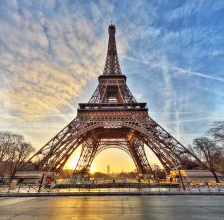
    <!-- Blur -->
    <img src="img/tour-eiffel.jpg" alt="tour-eiffel"
        :box="filter[Blur(2px)]">

    <!-- Saturate -->
    <img src="img/tour-eiffel.jpg" alt="tour-eiffel"
        :box="filter[saturate(40%)]">

    <!-- Mix -->
    <img src="img/tour-eiffel.jpg" alt="tour-eiffel"
        :box="filter[contrast(175%) saturate(90%)]">
Mix-blend mode
This property defines how the content of an element (or a picture) should mix with its direct parent background.
    <!-- Normal -->
    <div :box="bg[orange] p[0 .5rem]">
        <img src="img/logo-modCSS.png" alt="logo-modCSS">
    </div>

    <!-- Multiply -->
    <div :box="bg[orange] p[0 .5rem]">
        <img src="img/logo-modCSS.png" alt="logo-modCSS"
        :box="mbm[multiply]">
    </div>

    <!-- Exclusion -->
    <div :box="bg[orange] p[0 .5rem]">
        <img src="img/logo-modCSS.png" alt="logo-modCSS"
        :box="mbm[Exclusion]">
    </div>

    <!-- Difference -->
    <div :box="bg[orange] p[0 .5rem]">
        <img src="img/logo-modCSS.png" alt="logo-modCSS"
        :box="mbm[Difference]">
    </div>
Opacity
Opacityis used to set the transparency of an element.
        <!-- 80% -->
        <div :box="op[80%]"></div>

        <!-- 50% -->
        <div :box="op[50%]"></div>

        <!-- 30% -->
        <div :box="op[30%]"></div>

        <!-- 10% -->
        <div :box="op[10%]"></div>
Overflow
This is CSS a shorthand property who sets the desired behavior for an element's overflow (when an element's content is too big to fit in its block formatting context) in one or both directions.
So, you can set overflow-x or overflow-y properties.
lorem ipsum dolor sit amet consectetur adipisicing elit sed do eiusmod tempor incididunt ut labore et dolore magna aliqua officiis sapiente consequuntur tenetur similique quas facilis eveniet doloremque optio asperiores dolorum eum minus possimus dolor iure eaque voluptatem magnam inventore
lorem ipsum dolor sit amet consectetur adipisicing elit sed do eiusmod tempor incididunt ut labore et dolore magna aliqua non voluptate assumenda quos soluta repudiandae molestias aspernatur consequuntur error optio in consectetur nihil similique maiores possimus itaque dolorum sed natus
lorem ipsum dolor sit amet consectetur adipisicing elit sed do eiusmod tempor incididunt ut labore et dolore magna aliqua repellendus saepe ipsam debitis beatae eligendi optio dignissimos ipsum iure reprehenderit eos nisi nihil voluptatibus repudiandae id sequi facilis dolorum ullam
lorem ipsum dolor sit amet consectetur adipisicing elit sed do eiusmod tempor incididunt ut labore et dolore magna aliqua ut architecto non recusandae qui excepturi dolores vero perspiciatis doloribus aliquid dolore error repellendus commodi nobis ullam magni nisi vitae laudantium
    <!-- hidden -->
    <div :box="ovf[hidden]">
        <p>{% lorem 40 w %}</p>
    </div>

    <!-- scroll -->
    <div :box="ovf[scroll]">
        <p>{% lorem 40 w %}</p>
    </div>

    <!-- auto -->
    <div :box="ovf[auto]">
        <p>{% lorem 40 w %}</p>
    </div>

    <!-- scrollX-scroll, scrollY-hidden -->
    <div :box="ovf.x[scroll] ovf.y[hidden]">
        <p>{% lorem 40 w %}</p>
    </div>
Transform
This property applies a 2D or 3D transformation to an element.
All transform effects are supported by MOD CSS. Below, you can see some example on how to use it.
    <!-- translate -->
    <img src="img/logo-modCSS.png" alt="logo-modCSS"
        :box="trf[translateY(10px)]">

    <!-- rotate -->
    <img src="img/logo-modCSS.png" alt="logo-modCSS"
        :box="trf[rotate(45deg)]">

    <!-- scaleY -->
    <img src="img/logo-modCSS.png" alt="logo-modCSS"
        :box="trf[scaleY(.5)]">

    <!-- skewY -->
    <img src="img/logo-modCSS.png" alt="logo-modCSS"
        :box="trf[skewY(20deg)]">
Transition
The transition CSS property is a shorthand property for transition-property, transition-duration, transition-timing-function, and transition-delay.
It is used to define the transition between two states of an element. Different states can be defined with MOD CSS by using pseudo-classes such as hover or checked.
    <!-- all .5s ease-out -->
    <img src="img/logo-modCSS.png" alt="logo-modCSS"
        :box="trn[all .5s ease-out] && hover: trf[translateY(10px)]">


    <!-- transform 1s ease-in-out -->
    <img src="img/logo-modCSS.png" alt="logo-modCSS"
        :box="trn[transform 1s ease-in-out] && hover: trf[rotate(45deg)]">


    <!-- Detailed setting with cubic function 0.25s -->
    <img src="img/logo-modCSS.png" alt="logo-modCSS"
        :box="trn.du[0.25s] trn.tf[cubic-bezier(0.165, 0.84, 0.44, 1)] trn.pr[transform] && hover: trf[scaleY(.5)]">


    <!-- With delay 1s -->
    <img src="img/logo-modCSS.png" alt="logo-modCSS"
        :box="trn[all .3s cubic-bezier(0.165, 0.84, 0.44, 1)] trn.de[1s] && hover: trf[skewY(20deg)]">
Visibility
Specifies whether or not an element is visible.
    <!-- Visible -->
    <div :box="v[visible]"></div>


    <!-- Hidden -->
    <div :box="v[hidden]"></div>
Z-index
Specifies a layering or stacking order for positioned elements.
    <div :box="zx[20]">20</div>
    <div :box="zx[2]">2</div>
    <div :box="zx[3]">3</div>
    <div :box="zx[1]">1</div>
Cursor
Specify the type of cursor for given element.
(Please hover elements to see effects)
    <div :box="cu[auto]">Auto</div>
    <div :box="cu[pointer]">Pointer</div>
    <div :box="cu[text]">Text</div>
    <div :box="cu[zoom-out]">zoom-out</div>
    <div :box="cu[progress]">progress</div>